pythonでグラフを作るとき、自分好みのデザインにするのにいつも苦労する。
seabornもおしゃれでいいのだけど、みんなが使いすぎていてpython感が出すぎるので、Excelで作ったみたいなデザインにするにはどうするかを頑張ってみた。
今後自分のメモ用にいくつかのパターンを作ってみたいと思う。
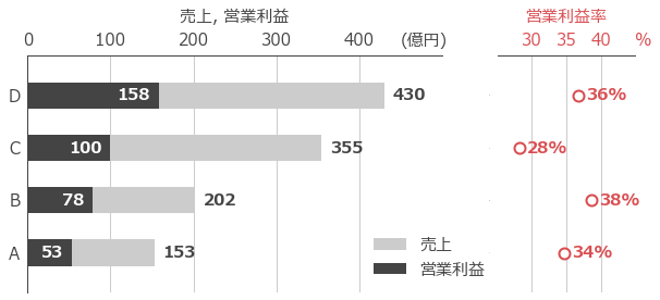
今回はこの横棒グラフ+散布図。サブプロットを二つ用意して、一つの要素は別のサブプロットに表示することにした。
一つのグラフを作るのにこんなに長くなるのが本当に正しいのかは結構疑問だが、デザインは求めているものになった。エクセル使えと自分でも思うのだが、希にpythonでデータを処理したいときもあるのでコツコツと作っておく。
今回横向きで作成したが、縦向きも作りたい。
import numpy as np
import matplotlib.pyplot as plt
import japanize_matplotlib
import matplotlib.gridspec as gridspec

#データ
sales_1 = np.array([153, 202, 355, 430])#棒グラフのデータ
sales_2 = np.array([53, 78, 100, 158])#棒グラフのデータ
profit = sales_2 / sales_1 * 100#散布図のデータ
labels = ['A', 'B', 'C', 'D']#x軸のラベル
ind = np.arange(len(sales_1)) #要素の数

#色
c_1 = '#cccccc'#棒グラフ用。濃いグレー
c_2 = '#444444'#棒グラフ用。薄いグレー
c_3 = "#d94d51"#散布図用。赤い色
c_gray = "#444444" #軸の色
c_gray2 = "#cccccc"#薄いグレー

#サイズ
label_s1 = 15#文字サイズ

#グラフサイズ
fig_x = 10
fig_y = 4

fig = plt.figure(figsize=(fig_x,fig_y))#グラフの作成

# gridspecを初期化し、2つの列を定義。ここで列の横幅を指定。
gs = gridspec.GridSpec(1,2, width_ratios=[3, 1])  # 3:1の横幅の比率でサブプロットを配置
ax1 = fig.add_subplot(gs[0])#subplotの作成(左側)
ax2 = fig.add_subplot(gs[1])#subplotの作成(右側)

#フォント指定
plt.rcParams['font.family'] = 'Meiryo'

#横棒グラフ
bar_w = 0.5 #棒グラフの太さ
p1 = ax1.barh(ind, sales_1, color=c_1, label='売上', height=bar_w)#横棒グラフ
p2 = ax1.barh(ind, sales_2, color=c_2, label='営業利益', height=bar_w)#横棒グラフ

#散布図
s_size = 100
s_lw = 2
s1 = ax2.scatter(profit, ind, color=c_3, s=s_size, facecolor="white", linewidth=s_lw, label='営業利益率')

#y軸
y_ticks_space = 0.75
y_ticks = [ind[0]-y_ticks_space, ind[-1]+y_ticks_space]#y軸のスペースを調整
#ax1-y軸
ax1.set_ylim(y_ticks[0], y_ticks[1])#y目盛の範囲
ax1.tick_params(axis='y', which='both', bottom=False, top=False)#xticksの目盛を消す
ax1.set_yticks(ind)
ax1.set_yticklabels(labels, fontsize=label_s1, color=c_2)#x軸のラベルの設定
#ax2-y軸
ax2.set_ylim(y_ticks[0], y_ticks[1])#y目盛の範囲
ax2.tick_params(axis='y', which='both', bottom=False, top=False)#xticksの目盛を消す
ax2.set_yticks(ind)
ax2.set_yticklabels(labels, fontsize=0, color=c_2)#x軸のラベルの設定(fontsize=0にして文字を消す)

#ax1-x軸
x_ticks = [0,500]#軸ラベルの値
x_ticks_l = [0,100,200,300,400]
grid_w = 1
ax1.set_xlabel("売上, 営業利益", fontsize=label_s1, fontfamily = 'Meiryo', color=c_2, labelpad=10)#軸ラベル
ax1.set_xlim(x_ticks[0], x_ticks[1])#x目盛の範囲
ax1.set_xticks(x_ticks_l, color=c_2)#x軸目盛線の設定
ax1.set_xticklabels(x_ticks_l, fontsize=label_s1, color=c_2)#x軸目目盛ラベルの設定
ax1.grid(axis="x", lw=1, c=c_gray2)#x軸目盛線をありに
ax1.xaxis.tick_top()#x軸を上側に
ax1.xaxis.set_label_position('top')#x軸ラベルを上側に

#枠線を消す
spine_w = 1
ax1.spines['top'].set_linewidth(spine_w)
ax1.spines['top'].set_color(c_2)
ax1.spines['bottom'].set_linewidth(0)
ax1.spines['left'].set_linewidth(spine_w)
ax1.spines['left'].set_color(c_2)
ax1.spines['right'].set_linewidth(0)

#x2軸
x2_ticks = [25,45]#軸ラベルの値
x2_ticks_l = [30,35,40]
grid_w = 1
ax2.set_xlabel("営業利益率", fontsize=label_s1, fontfamily = 'Meiryo', color=c_3, labelpad=10)#x軸ラベル
ax2.set_xlim(x2_ticks[0], x2_ticks[1])#x目盛の範囲
ax2.set_xticks(x2_ticks_l, color=c_3)#x軸目盛線の設定
ax2.set_xticklabels(x2_ticks_l, fontsize=label_s1, color=c_3)#x軸目目盛ラベルの設定
ax2.grid(axis="x", lw=1, c=c_gray2)#x軸目盛線をありに
ax2.xaxis.tick_top()#x軸を上側に
ax2.xaxis.set_label_position('top')#x軸ラベルを上側に

#枠線を消す
spine_w = 1
ax2.spines['top'].set_linewidth(spine_w)
ax2.spines['top'].set_color(c_2)
ax2.spines['bottom'].set_linewidth(0)
ax2.spines['left'].set_linewidth(0)
ax2.spines['right'].set_linewidth(0)

# 売上の数値を棒グラフの上に表示
for rect in p1:
    height = rect.get_height()
    width = rect.get_width()
    ax1.text(width+50, rect.get_y() + rect.get_height()/2,
            '%d' % int(width), ha='right', va='center', color=c_gray, fontweight='bold', fontsize=label_s1)

for rect in p2:
    height = rect.get_height()
    width = rect.get_width()
    ax1.text(width-10, rect.get_y() + rect.get_height()/2,
            '%d' % int(width), ha='right', va='center', color="#ffffff", fontweight='bold', fontsize=label_s1)

# 営業利益率の数値を棒グラフの上に表示
for n in ind:
    ax2.text(profit[n]+7, n,
            '%d' % int(profit[n])+"%", ha='right', va='center', color=c_3, fontweight='bold', fontsize=label_s1)

#xticksの目盛線を消す
ax1.tick_params(axis='both', which='both', bottom=False, top=False, left=False, right=False, color=c_2)#x1軸
ax2.tick_params(axis='both', which='both', bottom=False, top=False, left=False, right=False, color=c_3)#x2軸

#軸を背面に移動
ax1.set_axisbelow(True)
ax2.set_axisbelow(True)

#軸の単位を表示
fig.text(0.6, 0.93, '(億円)', ha='left', va='center', color=c_2 , fontsize= label_s1)#x軸単位
fig.text(0.9, 0.93, '%', ha='left', va='center', color=c_3 , fontsize= label_s1)#x軸単位

#凡例
ax1.legend(loc='lower left', fontsize=label_s1, bbox_to_anchor=(0.8,0), labelcolor=c_gray, facecolor='white', framealpha=1, frameon=True, edgecolor="white")#棒グラフの凡例